「できるだけ画像を使わずにテキストのコーディングをしたい」
「SVGで文字装飾するにはどうしたらいいの?」

こんな悩みにお答えします。
じつは、SVGはベクター画像として大きく引き伸ばしてもぼやけないというだけでなく、CSSよりもいろいろな文字装飾をすることができます。
この記事では、SVGのtextを使った文字装飾を紹介しています。
記事を読み終えると、SVGを使って複雑な文字装飾も画像を使わずにできることが増え、Web制作、コーディングの効率化、公開後の保守管理がしやすくなります。
- 目次
SVGのtextを使って文字装飾をする方法
タグ
SVGで使うおもなタグです。
実際に出力したいテキストや図形をillustratorで作成し、SVGで出力してみたりすると、どのタグをどのように使えばいいかがわかりやすいかもしれません。
- text … 表示するテキストを囲みます。
- defs … 何度も使いまわすタグを指定しておきます。ここに書くだけだと表示されません。
- use … defsで指定されているタグをhref属性で呼び出して表示します。
- line … 線を描画します。
- rect … 四角形を描画します。
- circle … 円を描画します。
- pattern … パターンを定義します。
- mask … マスクを定義します。
- clipPath … クリッピングパスを定義します。
- linearGradient … グラデーションを定義します。
属性
- fill … 塗りつぶし色を指定します
- stroke … アウトライン色を指定します
- stroke-width … アウトライン幅を指定します
SVGのtextを使った文字装飾
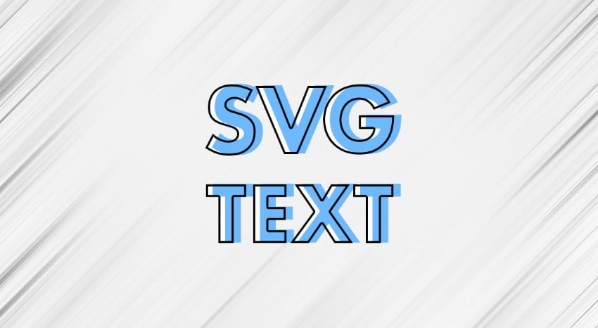
テキストにアウトラインをつける
単純なアウトラインはstroke属性またはCSSのstrokeで指定するだけで実現できます。
<svg xmlns="http://www.w3.org/2000/svg" width="100%" height="100%">
  <style>
    .text{
      font-size: 80px;
      font-weight: bold;
      font-family: "Noto Sans JP", sans-serif;
    }
  </style>

  <text id="text" class="text" x="5" y="100" fill="#6db9fc" stroke="#000" stroke-width="2">
    SVGテキスト
  </text>
</svg>
テキストに複数のアウトラインをつける
複数のアウトラインをつける場合は、同じテキストを重ねて、下のレイヤーにくるテキストのstroke-widthを大きい値にして外側のアウトラインにします。
<svg xmlns="http://www.w3.org/2000/svg" width="100%" height="100%">
  <style>
    .text{
      font-size: 80px;
      font-weight: bold;
      font-family: "Noto Sans JP", sans-serif;
      stroke-mode: outside;
    }
  </style>
  <defs>
    <text id="text0">
      SVGテキスト
    </text>
  </defs>

  <use href="#text0" class="text" x="5" y="100" fill="#000" stroke="#000" stroke-width="14" />
  <use href="#text0" class="text" x="5" y="100" fill="#fff" stroke="#fff" stroke-width="10" />
  <use href="#text0" class="text" x="5" y="100" fill="#6db9fc" />
</svg>
テキストに複数のアウトラインを使ってドロップシャドウにする
応用すると位置を少しずらして、アウトラインの外側にドロップシャドウをつけることもできます。
<svg xmlns="http://www.w3.org/2000/svg" width="100%" height="100%">
  <style>
    .text{
      font-size: 80px;
      font-weight: bold;
      font-family: "Noto Sans JP", sans-serif;
      stroke-mode: outside;
    }
  </style>
  <defs>
    <text id="text0">
      SVGテキスト
    </text>
  </defs>

  <use href="#text0" class="text" x="9" y="102" fill="#000" stroke="#000" stroke-width="13" />
  <use href="#text0" class="text" x="5" y="100" fill="#fff" stroke="#fff" stroke-width="10" />
  <use href="#text0" class="text" x="5" y="100" fill="#6db9fc" />
</svg>
テキストとアウトラインをズラす
テキスト本体とテキストのアウトラインをズラした装飾です。
テキストに限らず、最近このデザイン多いですね。
同じテキストを2つ使うので、defsタグの中にtextタグを書きます。
useタグのhref属性で#textを呼び出し、ベタ塗りのテキストとアウトラインだけのテキストを表示させ、x、yで位置を調整します。
<svg xmlns="http://www.w3.org/2000/svg" width="100%" height="100%">
  <style>
    .text{
      font-size: 80px;
      font-weight: bold;
      font-family: "Noto Sans JP", sans-serif;
    }
  </style>
  <defs>
    <text id="text1">
      SVGテキスト
    </text>
  </defs>

  <use href="#text1" class="text" x="5" y="100" fill="#6db9fc" />
  <use href="#text1" class="text" x="0" y="100" fill="none" stroke="#000" stroke-width="2" />
</svg>
ストライプのドロップシャドウ
ドロップシャドウにストライプで塗りつぶします。
textタグのfill属性には色だけでなく、patternを呼び出して塗りつぶすことができます。
<svg xmlns="http://www.w3.org/2000/svg" width="100%" height="100%">
  <style>
    .text{
      font-size: 80px;
      font-weight: bold;
      font-family: "Noto Sans JP", sans-serif;
    }
  </style>
  <defs>
    <pattern id="stripe" patternUnits="userSpaceOnUse" width="5" height="5" patternTransform="rotate(45)">
      <line x1="0" y="0" x2="0" y2="5" stroke="#000" stroke-width="2" />
    </pattern>
    <text id="text1">
      SVGテキスト
    </text>
  </defs>

  <use href="#text1" class="text" x="5" y="102" fill="url(#stripe)" />
  <use href="#text1" class="text" x="0" y="100" fill="#6db9fc" />
</svg>
以下のサイトを使うとSVGのストライプをかんたんに設定することができます。
ゴールド(グラデーション)
ゴールドの光沢を表現するために、テキストにグラデーションをかけます。
textタグのfill属性にlinearGradientを呼び出して塗りつぶします。
ゴールドテキストが映えるように黒背景のrectを追加しています。
テキストの装飾には不要です。
<svg xmlns="http://www.w3.org/2000/svg" width="100%" height="100%">
  <style>
    .text1{
      font-size: 80px;
      font-weight: bold;
      font-family: "游明朝体", "Yu Mincho", YuMincho, "MS P明朝", "MS PMincho", serif;
    }
  </style>
  <defs>
    <linearGradient id="gold" x1="0" y1="0" x2="0" y2="1">
      <stop offset="0%" stop-color="#76653d" />
      <stop offset="35%" stop-color="#c49758" />
      <stop offset="50%" stop-color="#e5d170" />
      <stop offset="65%" stop-color="#c49758" />
      <stop offset="100%" stop-color="#76653d" />
    </linearGradient>
    <text id="text1">
      SVGテキスト
    </text>
  </defs>

  <rect width="100%" height="100%"  fill="#000"></rect>
  <use href="#text1" class="text1" x="20" y="100" fill="url(#gold)" />
</svg>
テキストを画像で塗りつぶし
背景画像をテキストで切り抜いたような感じですが、やっていることはテキストを画像で塗りつぶしています。
imageを直接fillには指定できないらしく、imageを含んだpatternをtextのfillに指定します。
<svg xmlns="http://www.w3.org/2000/svg" width="100%" height="100%">
  <style>
    .text{
      font-size: 80px;
      font-weight: bold;
      font-family: "Noto Sans JP", sans-serif;
    }
  </style>
  <defs>
    <pattern id="image" patternUnits="userSpaceOnUse" width="800" height="800">
      <image href="<?php echo esc_url( get_template_directory_uri() . "/images/bg-sakura.jpg" ); ?>" x="0" y="0" width="850" height="566" />
    </pattern>
  </defs>

    <text id="text" class="text" x="20" y="100" fill="url(#image)">
      SVGテキスト
    </text>
</svg>
背景をテキストで切り抜き
背景色をテキストで切り抜き、さらに奥の画像が見えるようにしています。
msask直接に塗りつぶした背景とテキストを設定することでテキストを切り抜きます。
fillの色(白黒)を入れ替えることでテキストの抜き方が逆になります。
<svg xmlns="http://www.w3.org/2000/svg" width="100%" height="100%">
  <style>
    .text{
      font-size: 80px;
      font-weight: bold;
      font-family: "Noto Sans JP", sans-serif;
    }
  </style>
  <defs>
    <mask id="mask">
      <rect x="10" y="10" width="80%" height="80%" fill="#fff"></rect>
      <text id="text" class="text" x="100" y="100" fill="#000">
        SVGテキスト
      </text>
    </mask>
  </defs>

  <image href="<?php echo esc_url( get_template_directory_uri() . "/images/bg-sakura.jpg" ); ?>" x="0" y="0" width="850" height="566" />
  <rect x="10" y="10" width="80%" height="80%"  fill="#000" mask="url(#mask)"></rect>
</svg>
テキストに図形をのせて重なった部分の色を反転
テキストに図形をのせて重なった部分の色を反転させる。
CSSだけでもできます。
<svg xmlns="http://www.w3.org/2000/svg" width="100%" height="100%">
  <style>
    .text1{
      font-size: 80px;
      font-weight: bold;
      font-family: "游明朝体", "Yu Mincho", YuMincho, "MS P明朝", "MS PMincho", serif;
    }
    #circle{
      mix-blend-mode: difference;
    }
  </style>
  <defs>
    <text id="text1">
      SVGテキスト
    </text>
  </defs>

  <rect width="100%" height="100%"  fill="#000"></rect>
  <use href="#text1" class="text1" x="50" y="100" fill="#fff" />
  <circle id="circle" cx="100" cy="70" r="100" fill="#fff"></circle>
</svg>
まとめ
SVGのtextを使って文字装飾をする方法を解説しました。
- テキストにアウトラインをつける
- テキストに複数のアウトラインをつける
- テキストに複数のアウトラインを使ってドロップシャドウにする
- テキストとアウトラインをズラす
- ストライプのドロップシャドウ
- ゴールド(グラデーション)
- 画像文字
- 文字切り抜き
- テキストに図形をのせて重なった部分の色を反転
SVGを使って複雑な文字装飾も画像を使わずにできることが増え、Web制作、コーディングの効率化、公開後の保守管理がしやすくなります。


